
What was wrong
Each marketplace shows a buyer only what's listed inside it. A regular who liked what they bought had to be told which three apps to search, then search each one.
- No single link to send anyone: not in a bio, on a card, on a receipt, or in reply to "what else have you got?"
- No view of the whole inventory, for buyers or for the seller.
- Nothing searchable across all three.
- Everything rented. Change the fees or the algorithm, close the account, and the storefront goes with it.
What I built
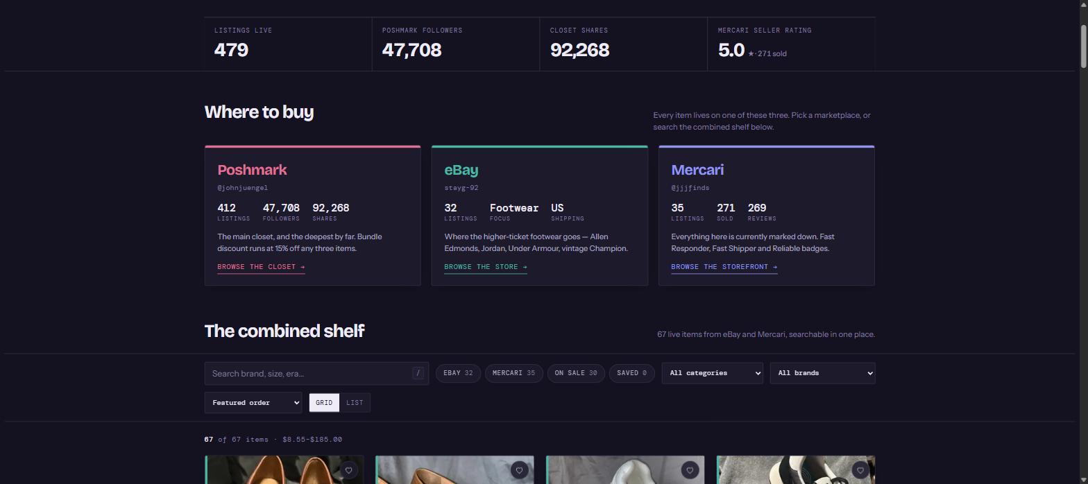
One page that is the whole inventory. The three marketplaces sit across the top as cards with live listing counts. Underneath is the shelf: every item from all three in one grid, with filters.
- Filters for hunting, scrolling for browsing, on the same grid.
- Counts that follow the listings, so the page never shows stock that sold last spring.
- Checkout stays on the marketplace, which already handles payment and buyer protection. Rebuilding that would have been worse at ten times the price.
- Designed at phone width first, because resale browsing is a thumb on a sofa.
The marketplaces keep the checkout. The site keeps the customer.
That split is the whole design, and it cost the base price.
What's different now
No sales or traffic numbers: those are the client's to publish, not mine. What's different is the site itself.
- One link that answers "what else have you got?" completely.
- The whole inventory in one view, searchable across all three marketplaces, which none of the three will do.
- Counts that age with the stock instead of against it.
- An address they own, in their name. Fees, algorithms and accounts can change; the shelf stays.