
Case study · Behavioral health practice
Two kinds of care,
shown as one plan.
Seven pages for a practice offering talk therapy and medication management. The build's whole job is to make a frightened person on a phone at 11pm understand that those are one plan of care, not two appointments to work out how to book.
- Field
- Behavioral health
- Build
- Seven pages
- Central idea
- One plan, two kinds of care
- Price paid
- Base price
The problem
The visitor here is not shopping. They are usually a person having a bad week — or the family member of one — looking at a phone late at night, deciding whether to make a call that is difficult to make. Everything that makes them hesitate costs the practice a patient and costs that person weeks.
The site they landed on was doing the opposite of reassuring. It read the way medical sites read when nobody has thought about the reader: a wall of clinical service names, an insurance question left hanging, and a contact page that asked for a lot and promised nothing back.
- Therapy and medication read as two separate businesses. A visitor could not tell whether choosing one meant giving up the other, or whether they'd be starting over with a second provider.
- Clinical language, not human language. Correct, and useless to somebody who does not yet have a word for what is wrong.
- The first step was never stated. No answer to "what actually happens if I call?" — which is the only question that matters at that moment.
- Cold to look at. Stock photography and hospital blue, on a subject where the design is doing half the reassuring.
What got built
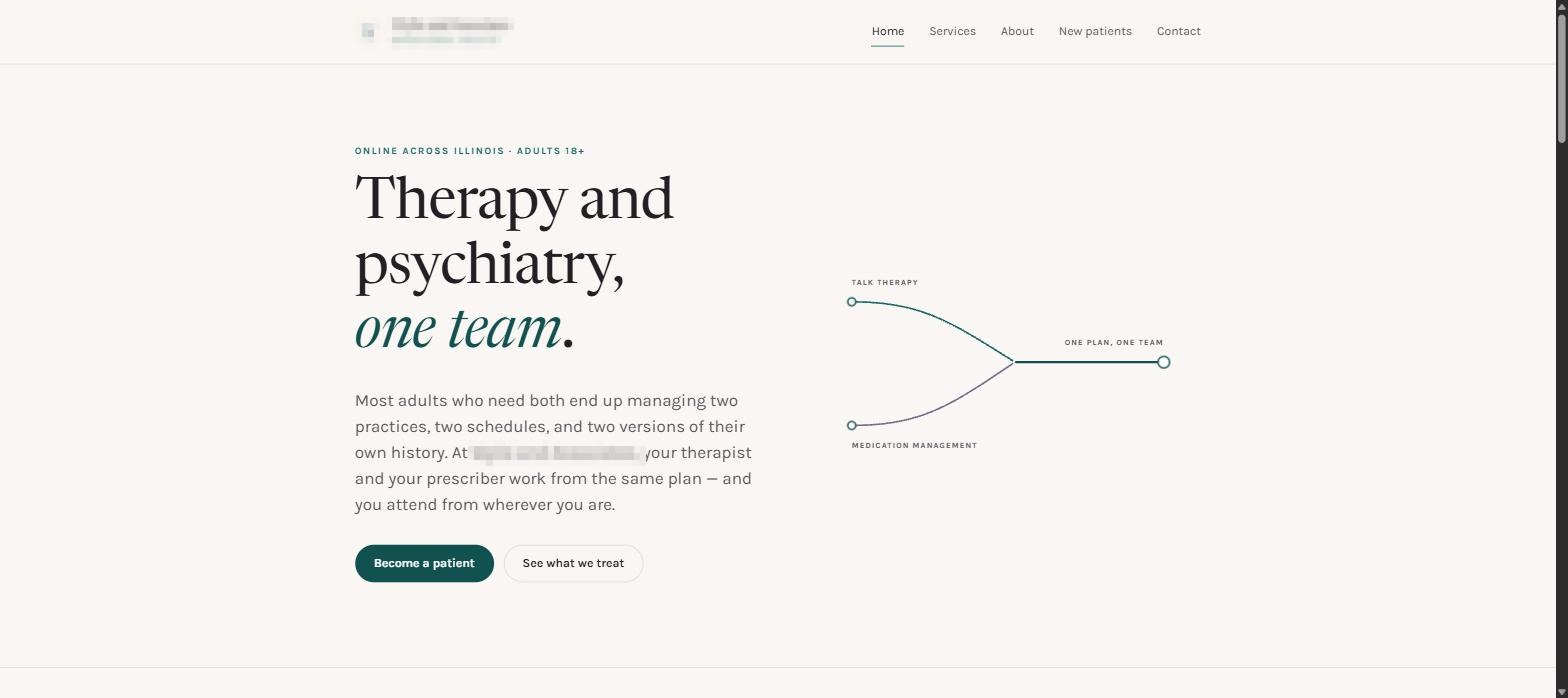
Seven pages, built around one diagram. The homepage draws talk therapy and medication management as two lines that join — one plan, one team, one place — because a sentence saying so is read and forgotten, and a picture of it is understood before it is read.
- A calm surface, on purpose. Warm cream rather than clinical white, a serif face rather than the default sans. It is a room that has been made comfortable rather than a facility that has been made sterile.
- The care model shown, not asserted. The diagram carries the point the practice's whole positioning rests on, and it carries it above the fold.
- Plain words in front, clinical words behind. The page speaks the way a person describes their own week; the precise terms are there for anybody who wants them, one level down.
- What happens when you call, in order. Stated explicitly, because the unknown is the barrier — not the price and not the diagnosis.
- Contact that does not interrogate. The fewest fields that let somebody be phoned back, and a plain statement of when that will happen.
- Phone-first. This is read on a phone, at night, one-handed. That was the layout the design started from rather than the one it degraded into.
Same base price as the freight site on the next page over.
Two trades that could not be less alike, two builds that share no template, one number. That is not a discount — it is what happens when the price stops being a guess about what a trade can afford.
What changed
No numbers here — the practice's figures are theirs, not mine to publish. What follows is what is demonstrably different about the site itself.
- The care model is answered on arrival. Somebody landing cold now understands that therapy and medication are one plan before they scroll, which was the single question the old site left open.
- The first step is written down. What happens when you call is on the page, so making the call stopped being a leap into an unknown process.
- It reads like a person wrote it. The language a patient would use is the language on the page, with the clinical terms available rather than mandatory.
- It is legible at 11pm on a phone. Which is when it is actually read — a fact the previous layout had clearly never been tested against.
- Messages arrive as messages. Straight to the practice's inbox, no portal, nothing to log into, nothing that quietly stops working.
- It can be changed the same day. New clinician, new hours, a new insurer accepted — a text, and it is live.
The next one is nothing like it A heavy haul carrier — same base price, opposite problem.
Read that case studyWondering what a build like this costs? The whole price list is one page, and there is a longer answer in what a small business website should cost.
Tell me what you do.
I'll show you what it'd look like.
Two days, no charge, no obligation. Don't like it? Keep it anyway.
Call or text 618-882-1996 · email [email protected]
Clients aren't named on this site. Yours wouldn't be either, unless you asked to be.